“The design of history is the history of design” – Ivan Chermayeff
What is the history of graphic design in Malaysia? Although it played a critical role in the transformation of Malaya’s villages and streets into Malaysia’s main cities, graphic arts went through a journey of inception and development that gradually became a neglected part of the country’s landscape and history. Malaysia Design Archive is a project that aims to unearth part of this story, and to trace the indentations that graphic design have left in the unfolding of our nation. From this attempt, I will provide a glimpse into the story of Graphic Design in Malaysia through the periods of colonialism, occupation and emergency.
Beginnings
Graphic arts can be identified from as early as the 15th century, when Malacca’s strategic location became one of the major international trading routes that attracted merchants who came to use Malacca’s warehousing and trade facilities to advance their trading positions. It was a meeting point and cultural crossing that led towards an unstoppable exchange of design influences – Arab merchants brought with them ornate Islamic texts, Chinese brought porcelains, luxurious silks, paper and printing presses, Indian traders brought colorful textiles. A period before photography and printing machines, these socio-cultural and economic activities were documented through engravings, illustrations as well as maps1. Such artifacts provide us with the spirit of the time, its cultural trends and tastes. These needs have been filled by various people in Malaya, including scribes, engravers and mapmakers, many of whom have been creative artists that have not been sufficiently recognized2.
The arrival of the British colonizers in the 19th century, eager to boast their vanguard industrial position, resulted in a plethora of printed information: flags and crests of colonizing power, illustrated information such as advertisements, logos, travel posters to editorial publications, magazines and newspapers that followed foreign guidelines, and with the setting up of the postal service and education, new stamps and books3. This was a period of massive change in the country, where modern graphic design began to emerge.
1850 to 1943 : Modernization and Commerce
In the 19th century, Malaya became one of the captured colonies of the British imperialist power. With the increase of British intervention in the country, traditional lifestyles began to change. Many Malay rulers had lost much of their power to the British Residents, demographics were changing with huge influxes of Chinese workers working in tin mines and plantations, and villages had become bustling towns with burgeoning merchant class and European-style streetscapes4. During this time, graphic design was used by the British as part of their strategy to expand its powerful enterprise, which resulted in the development of graphic design as a marketing tool. In other words, graphic design was used to create the identity and ‘face’ of British Malaya.
A country that was going through a deep cultural transformation, graphic design experienced new ways of conveying. One of the many ways used by the colonists to engage with local markets was the production of its designs using multiple languages and typographies, as well as the adoptation of local symbols into their communications. For example, in 1902, the Simit company logo (now known as Sime Darby, what was then a small British company trading in tin and rubber) illustrated a set of scales to emphasize its trading activities and incorporated Chinese script into its identity. Here, the logo design was used as a vocabulary, a visual language bridging and connecting the colonists with the local markets, which was then dominated by the Chinese community.
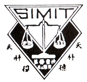
1. 1902, Simit logo
The adoption of local symbols within colonists’ ideologies was also evident in the production of newspapers. Newspapers, which were widely distributed, were used to disseminate the colonists’ ideals, customs and agenda. Through advertising, colonists took steps to adapt foreign ads to local languages and systems of symbolic exchange. Among them was the Tiger advertisement below. Fraser & Neave used visibly local women and Jawi script5 in their advertisement to attract or speak to the local markets in its promotion of Tiger beer. Again, design was used as a marketing tool, bridging between the advertiser with its consumer. The number of British locally adapted advertisements continued to grow when newspapers became the main platform to launch new foreign products – cars, cosmetics, medicines, consumer goods etc – and slogans were targeted mainly to the local market.
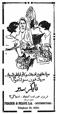
2. 1933, Tiger Beer advertisement distributed by Fraser & Neave
Numerous magazines, community newspapers and bulletins also existed. Each provided to the needs of different communities – serious, educational or humorous – and represented interests according to race and class. The content of these publications, were largely controlled through self censorship as a result of British licensing and sedition law. Therefore, symbolism used in these printed materials were found to be superficial in its rendering of the community. Among them was ‘Jajahan Melayu’, one of the first Malay language newspaper published in Taiping in 1896, written by and for the local Arab community. Its masthead denotes typically religious Islamic icons, which consisted of the crescent moon, star and scale. The male figure with a songkok6 were chosen to act as an interface, an avatar of the publication that is reflective of the community and religious belief. This also brings forward the question of gender, its representation and role in the society.
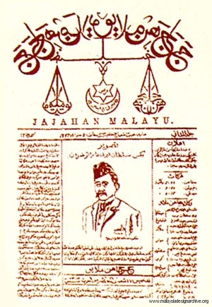 3. 1896, Jajahan Melayu
The colonists was not only building its foundation trading with consumer goods and manufacturing natural resources, but was also promoting Malaya as a tropical travel destination. As an alternative to advertisements, beautiful posters were commissioned and designed by local artists with the aim to promote Malaya as an ‘exotic’ alluring destination, using its ‘natives’ – especially women – as the subject matter. When observing these old posters, the use of composition and romantic colors appears to be a relatively ‘new’ approach of understanding nature and the environment, derived from Western art teachings. Deprived of our ‘own’ historical style, poster design was featuring paintings reminiscent of British watercolor paintings and style which generally feature a foreground, middle ground and a distant background7. Here, a new trend can be detected where there is a cross of influences between art and design.
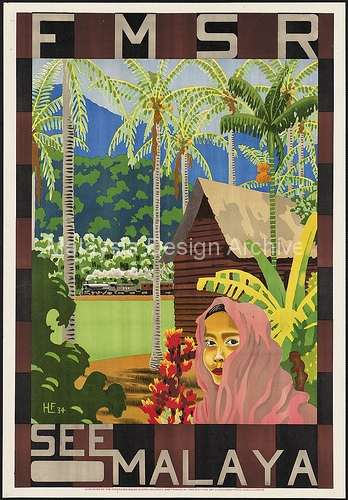 4. 1934, “See Malaya” Travel Poster
The British imperialist, fueled by this new conquest, benefited from its location, resources and people. They continued to colonise, commodify and profit from British Malaya for 150 years.
2. 1943 to 1945 : Period of Aesthetic Prejudices
Seizure of power by the Japanese in 1943 resulted in an armed uprising in the country, which saw a period of Japanese occupation for the next three years in Malaya. Life in this period had a defining impact on the handling of graphic arts, where all forms of printed media were turned into Japanese propaganda. The Japanese used a decisive lexicon of symbolism to obliterate icons of British imperialism, and confronted the people with imageries of the Japanese culture (most famously, the rising sun). Here, graphic design adapted and shifted its role appropriately, from commodification and trade to ‘persuasion’. In other words, design was used in the service of control and influence8, in this case, for the promotion of Japanese values9.
As a first step, the Japanese eliminated all forms of British icons and symbols from all graphic works, which resulted in the confiscation of printed materials and closing down of English schools. Japanese propaganda was carried out in the designing of new stamps, postcards, newspapers and books. The production of new stamps led to an underlying visual dialogue between the sender and the receiver. They almost acted like a ‘calling card’ for the Japanese to command the world’s attention, presenting a victorious symbol of their defeat of the British. This is evident in the stamps with the portrait of King George VI, where his image was overprinted manually with the words ‘Seal of Post Office of Malayan Military Department’ that formed a red frame over the stamps as a quick fix before new stamps were produced. The overprint effectively defaced the portrait of the British sovereign head10.
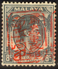
5. Stamp with King George VI
To help establish an ‘Asian’ identity, the Japanese administration organized the very first public stamp design competition. Five designs depicting scenes of Singapore and Malaya were selected and the stamps issued in 194311. In this 15 cent stamp, an image of rice being planted played both the function of depicting a typical scene in Malaya, as well as to symbolize new beginnings and growth. The weight of its lines, strong and bold almost like Japanese woodcut, with the rising sun in the background alluded to Japanese power.
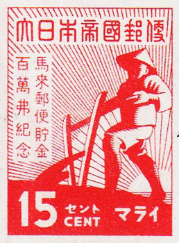
6. 1943, Savings Campaign Stamp
In the state of tension, the production of print publications during this period faced a conflict of styles and roles. New publications were produced to help impose, enforce and dictate the population into “living the Japanese way”. Contrasting from the British colonial times, where graphic design was used as a two-way communication tool between the product and consumer, here one-way communication was being experienced, where graphic communications commanded the attention of the population and demanded for their immediate compliance/action.
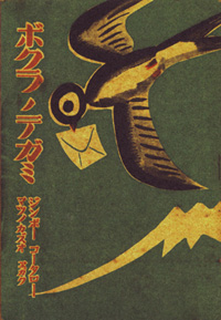
7. Basic Letter Writing Japanese books for Children
The movie industry collapsed during this period. The Japanese government forbade the screening of Western movies as part of its effort to abolish all Western influences, and only allowed the screening of Japanese and Malay movies. They screened mostly documentaries and propaganda films, again, to encourage the locals to adopt Japanese culture & morals of the samurai12.
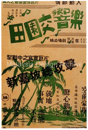
8. 1943, Chinese Advertisement for a Japanese propaganda film
This period closed with the desire for a new beginning. Graphic design, although gradually gaining its relevance, was restless and lost through a series of imposed values and purposes, and was longing for the need of a new identity, with a sense of real existence and belonging.
1945 to 1957 : New Emerging National Identity
In 1945, Malaya went back into the hands of the British, which led to a new fervor for nationalism. Graphic design that was developing in this new context attempted to show a more nationalistic undertaking, through its positioning of communications media and ideology of the nation. This period also saw a diversity of styles merging together, while a process of acute filtration was being carried out. In the process of building a new national identity, unwanted imagery and symbolism, (from internal and external factors) were deleted from all communications media. This period also saw an equal development between commercial communications and political propaganda; a visual and political struggle that continued until Malaya gained its independence.
Eruption of new aesthetics began to appear. Graphic appearances took on a more minimal approach – composition, use of lines, provocative forms and its intimate connection to symbolism started to emerge. This does not necessary mean that it was being safe in its visual expression, instead it took on a more radical and clearer transition into building a national identity. Relationship between typography, illustration and photography was also being explored and experimented with intensely in design, which benefited the government in rendering a clearer symbol and ‘mascot’ to win the hearts and mind of its citizens.
Posters in particular, served as an efficient foundation in spreading information in public places. For example, the poster below is used to call for enlistment into the military. Its illustration appears to be a Malay man wearing traditional attire but its visual expression appears to be remarkably menacing, a visual expression that’s never been seen before in this context. However, interestingly, its composition was undoubtedly influenced by America’s Uncle Sam poster with the same intention.
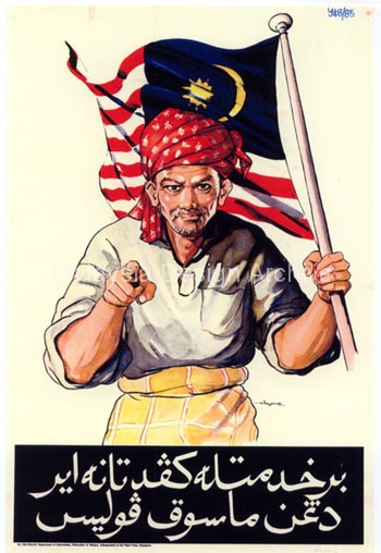
10. 1951, Berkhidmatlah Kepada Tanahair
A poster to persuade citizens to join the army.
Illustrated by Hossein Enas at 1951
Magazines by this period have matured in its visual expressions and its role for entertainment. The comic below featured the Malaccan Malay Muslim warrior, Hang Tuah, who was a national hero derived from the epic ‘Hikayat Hang Tuah’. The legend was made into films and featured almost everywhere. One example is this 1953 edition of ‘Majalah Comic Melayu’13. He is illustrated and presented as the familiar male figure in the same traditional attire. The use of primary colors on the cover is also reminiscent of the American superhero, Superman.
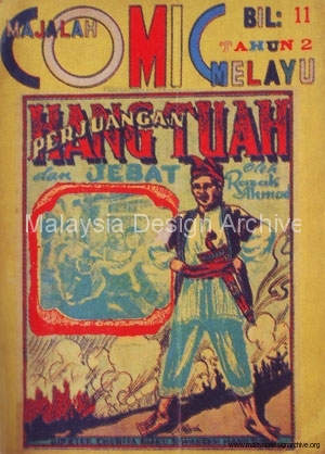
11. 1953, Comic Melayu – Perjuangan Hang Tuah
Here the appearance of male figure in traditional costume began to surface. This repeated imagery and the patriotic love story embodied by this symbol urged the people to hold him in regard. As a symbol interwoven with national propaganda that appeared in posters, magazines, books, he was a seductive figure made to appeal to all races and classes. He has gradually started to become the face of the public, the image of the people, and the symbol of trust
This period was also known as the period of “emergency”, where a guerrilla war was fought between the Commonwealth armed forces and the Malayan Communist Party14. This war led to the explosion of highly intense graphics propaganda. Graphics and illustrations with planted messages and political manipulations were distributed through different underground channels and network. These pamphlets were used to persuade, alert and alarm communists that took refuge in the forests of Malaya. However, under the circumstances of that time, such provocative visual communications were part of everyday life and were supported by the population who were trapped under the same foundation of conspiracy.
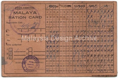
12. 1953, Malaya Ration Card
As part of the British overall strategy of ‘food denial’ to control provisions and interdict supplies to the insurgents, this ration card was distributed and used from 1953 to 1954.
This phase ended with Malaysia gaining its independence. While still without a graphic style or particular forms to characterize ‘Malaysian design’, we can begin to unravel the threads of influences through the choices of imagery and symbolism that were articulated, reiterated, diffused and persisted through different forms of design work.
As seen, taking a closer look at design artifacts and elements can present not only a clue to the development of both the advertising and graphic industry during that period, but also to its socio-cultural backdrop, relations and preoccupations.
–
Unfortunately, many graphic design products and artifacts have not been preserved in archives or collections in Malaysia. Added to the complexities of our historical past, this presents a difficult task of unfolding the historical details of our graphic design history – its processes, production capabilities, listings of organizations, creative agencies and directory of graphic designers. Malaysia Design Archive hopes to be an effort that can help unearth and document the lexicon of our graphic design history.
–
Written by Ezrena Marwan. This article was written for Kuala Lumpur Design Week 2010 and republished in Blueprint Asia, May/June 2010 issue.
Image Credits
- 1902, Simit Logo
The Encyclopedia of Malaysia: Volume 7 – Early Modern History (1800-1940). Didier Millet. - 1933, Tiger Beer advertisement
Collection of Fariza Azlina Isahak and National Archives of Malaysia - 1896, Jajahan Melayu
The Encyclopedia of Malaysia: Volume 7 – Early Modern History (1800-1940). Didier Millet. - 1934, “See Malaya” Travel Poster
Collection of Ezrena Marwan - Stamps with King George VI
http://swiftraft2000.com/default.aspx - 1943, Stamps “Savings” Campaign – From the article “Japanese Occupation of Malaya, The Pictorial Issues” by Susan McEwan
- Basic Letter Writing Japanese books for Children
National Archives of Singapore - Japanese Propaganda Poster
Millet, Raphael. Singapore Cinema. Didier Millet, 2007 - 1951, Berkhidmatlah Kepada Tanahair
National Archives of Malaysia - 1953, Majalah Comic Melayu (Malay Comic Magazine)
The Encyclopedia of Malaysia: Volume 14 – Crafts and Visual Arts. Didier Millet. - Malaya Ration Card
Collection of Ezrena Marwan
Copyrights of images remain with their copyright owners. This article is collating what is available and intended for educational purposes only.
- Moore, Wendy. Malaysia, A Pictorial History 1400 – 2004. Didier Millet, 2007:1 [↩]
- Meggs, Philips B. History of Graphic Design. Wiley, 2005:2 [↩]
- Jamal, Syed Ahmad. The Encyclopedia of Malaysia: Volume 14 – Crafts and Visual Arts. Didier Millet, 2007:3 [↩]
- Moore, Wendy. Malaysia, A Pictorial History 1400 – 2004. Didier Millet, 2007:4 [↩]
- Jawi script – an adapted Arabic alphabet for writing the Malay language:5 [↩]
- Songkok – a traditional Malay cap in the shape of a truncated cone, almost always made of black or embroidered felt, cotton or velvet.:6 [↩]
- Jamal, Syed Ahmad. The Encyclopedia of Malaysia: Volume 14 – Crafts and Visual Arts. Didier Millet, 2007:7 [↩]
- Heller, Steven. Design Literacy : Understanding Graphic Design. Allworth Press, 2004:8 [↩]
- Syonan Years 1942 – 1945, Living Beneath The Rising Sun. National Archives of Singapore, 2009:9 [↩]
- Syonan: Light of the South, A Story Told Through Stamps
(http://www.spm.org.sg/exhibition/syonan/index.html):10 [↩] - Syonan: Light of the South, A Story Told Through Stamps
(http://www.spm.org.sg/exhibition/syonan/index.html):11 [↩] - Millet, Raphael. Singapore Cinema. Didier Millet, 2007:12 [↩]
- Omar, Prof. Dato’ Dr Asmah Haji. The Encyclopedia of Malaysia: Volume 9 : Languages and Literature. Didier Millet. :13 [↩]
- Malayan Emergency – http://en.wikipedia.org/wiki/Malayan_Emergency:14 [↩]



1 Comments